
The story of Guard & Gather.
This whole venture really started with a shared obsession—me and my friends have been collecting cards for as long as we can remember. Sports cards, trading card games, you name it. It wasn’t just a hobby; it was something we genuinely loved doing.
Over time, as we got more into it and started understanding the real value behind these cards, we noticed a gap. The stuff that was supposed to help protect your collection—sleeves, binders, cases—was either too expensive or just... kind of boring. It felt like no one was really making products for people who actually cared about collecting, especially not at prices that made sense.
So we figured, why not do it ourselves? We wanted to build something that felt made for collectors—something affordable, but still solid and good-looking. A brand that anyone from a kid starting their first binder to a serious collector could get behind.
Brand Language
One of the first things we wanted to figure out was how to present ourselves as a premium-quality, low-cost, consumer-first store. That started with our branding. With those ideas in mind, I created reference boards of other card shop logos to get a sense of the typography and colors they used.
I found that card shops tend to take very different approaches. Some used bright, bold colors, others leaned more pastel or stayed monochromatic. Fonts varied too: some were bubbly and friendly, while others looked more sharp and professional.
A trend I noticed was the common use of playing cards in emblems. It makes sense—they're recognizable and quickly communicate what the store is about. But because so many stores use that visual, it’s easy to blend in.
With that in mind, I started thinking more intentionally about our brand language. I wanted our logo, color palette, and typography to stand out. The goal was to create something that still spoke to collectors but in a way that felt more unique and memorable.
Emblem
I started with the emblem.
We began by looking into the symbolism behind the word “guard,” which led us to the idea of protection. The reasoning for using a tower came from it being one of our first thoughts when we thought of safety and strength. From there, my teammates and I started creating an icon that incorporated that idea. We wanted it to look professional, so we kept the design monochromatic.
The final design I worked on was based on the letter G. Since our business is called Guard and Gather, we wanted to explore how the G could be worked into the emblem. After experimenting with different versions of the letter, we landed on a design that placed one G inside another, forming the shape of a shield.


In the end, we chose the third design for a couple of reasons.
The first design showed the idea of guarding well and had a sleek look that could appeal to both adults and children. But after doing more research, we realized that using a tower was fairly common in board game store logos. We were concerned that it might make people associate us too closely with that space.
The second design communicated the idea of community clearly and had a clean, simple look. But we felt it aligned more with industries like non-profits, humanitarian organizations, or tech companies, rather than a consumer-focused entertainment store.
The third design was more abstract. Aside from the shield, which symbolized protection, it didn’t directly reference our products. But that was part of why we chose it. The connection to what we sell was still there, just in a more flexible way. If we ever expanded into board games, comics, or other forms of entertainment, this emblem could grow with us. The others felt more tied to a specific concept. We also liked that the design followed a similar approach to larger companies by not relying on a literal symbol. At the same time, it kept just enough visual detail to reflect our focus on protection and entertainment.
The next step was figuring out our brand colors. I approach this kind of decision by experimenting with our products. I need to see how the colors actually look on things like packaging or a website to know if they work together.
At the same time, we had to start thinking about packaging for two of our first products: our toploader boxes and card sleeves. To begin testing color ideas, I focused on the card sleeves since their packaging is just a simple rectangle. Once I had a design I felt good about, I began experimenting with different color combinations. Below are several iterations of that design using various palettes.
For our second design, we wanted to focus on the idea of community, which we felt could be represented through hand gestures. The emblem was based on a simple concept: hands reaching toward a rectangular object. The idea was that this object could represent cards, accessories, or anything else people might gather around.
Colors


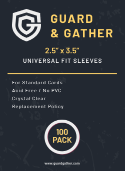


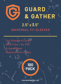
The design decisions for the sleeves is based on our goal of presenting a premium product, that is still inviting. I achieved this by using a Sans Serif font, to communicate modernity and a clean, premium product. The rest of the design elements follow this thinking, using sans serif, minimalist geometric shapes, and thoughtful spacing to showcase a well thought out brand language.
In the end we decided on a color palette of blue, yellow, white, and dark blue due to the colors evoking a sense of youth, playfulness, and invitingness. Additionally, blue is traditionally associated with security and trust, key traits we want to evoke. With this we now had a foundation on which we could base future design decisions on.


Toploaders
For our toploaders, we used the same brand language, starting to experiment with a clean backgroundm and a gradient.


As of now, we are in continued development of this brand and our products, which includes experimentation.